top of page

SMART NOTES

Fifteen minutes of chart-reading, turned into one AI dashboard

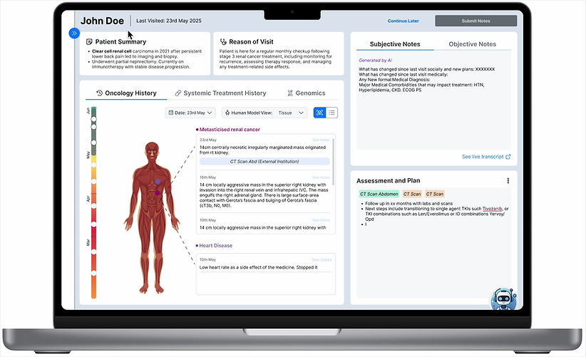
At Mayo Clinic, oncologists rebuilt a patient's story from a static document before every consult — flipping between labs, scans, and notes that never lined up. We redesigned that into an AI-assisted Smart Note anchored to a single timeline.

chatbot-3.png

ROLE

UX Research & Design

DURATION

Jan - May 2025

TEAM

2 Designers

TOOLS

Figma, FigJam, ChatGPT

01- PROBLEM

A 15-minute ritual before every patient walked into a consultation room.

Physicians relied on a manually assembled document to piece together a patient's history before oncology consults — slow, inconsistent, and easy to get wrong under time pressure.

1

Time away from patients

"I would love to use that time with my patients"

2

Text heavy notes

"Content is cluttered with no visual hierarchy"

3

Missing chain of trust

"Not certain if the summary is up to date"

02 - RESEARCH

We started in the hospital, not the file.

Shadowing at Mayo Clinic_edited.png

I shadowed a full clinic day.


Reviewing physicians go over patient notes before a consult.

Watching a physician take notes live during one.

Adding post-consult updates to a Word doc afterward.


That's the actual workflow we were redesigning.

Affinity Mapping

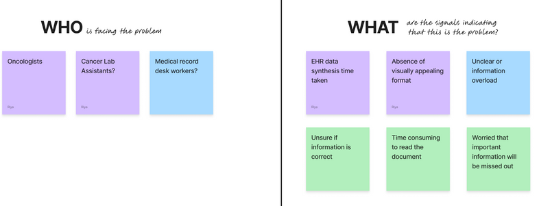
My teammate and I built a FigJam board to sort raw observations into who was affected, what signaled the problem, and why it was happening, before we let ourselves jump to solutions.

Output → A problem statement

"Oncologists don't lack information — they lack a way to trust it fast enough to act on."

Screenshot 2026-08-26 at 8.55.00 PM.png

Contextual interviews & co-ideation

gY8VGbQChgFLCnOf0YDpLYbqjFM.jpeg

We brought layout directions back to the same oncologists rather than testing cold — pressure-testing what would actually survive inside a real consult before committing to high fidelity.

Output → Two wireframe directions, narrowed to a single one with physician input

Usability testing

Once the prototype was clickable, sessions changed from "what do you think of this layout" to "find this lab result, compare these two scans, place this order" — timed, task-based, and run by the same oncologists who'd shaped the wireframes.

Output → Specific friction points, not just a layout people liked

Wireframe 2.png
Wireframe 1.png

03 - DESIGN DECISIONS

Two frictions, 6 decisions

Both screens below exist because of a specific moment of friction we watched happen. Here's the reasoning behind each one.

1. History was chronological in real life, scattered on the chart

Screenshot 2026-08-27 at 2.32.24 AM.png

01

Timeline of the oncology history

INSIGHT

​Order matches what physicians already reconstruct in their head, so all data is visually connecting.

03

Toggle switch between avatar and list view

INSIGHT

Lets a physician choose their interface incase they would like to compare the whole history.

02

An avatar view 

INSIGHT

Location and history read as one fact instead of two things to mentally connect.

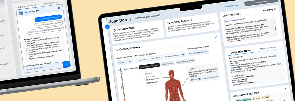
2. "What changed?" meant re-reading the whole chart

Screenshot 2026-08-27 at 3.25.27 AM.png

04

AI drafted notes that surface since last visit

INSIGHT

Answers the first question of every visit without a full re-read.

06

Built-in notes editor

INSIGHT

Keeps the physician as the final authority, not the AI.

05

A chatbot with starter questions pulled from patient history

INSIGHT

Surfaces context a physician would otherwise have to hold in memory

04 - WALKTHROUGH

See it in motion

The timeline, the AI note, and inline ordering — one pass through a consult, the way an oncologist would actually use it.

REFLECTION

The AI's value came not just from its ability to summarize, but also because it matched how oncologists already think — chronologically, mapped to the body, like a smart note.

1746415047173.jpeg
1746415052455-2.jpeg
bottom of page